Leaflet design basics: most common sizes and folds.

Deciding to invest in a leaflet can feel like a big step for a small business, it certainly has been for me at the time.
It’s something more corporate and structured than a simple flyer, and it’s a bigger investment as well, both for design and printing costs.
Let’s see together the most common sizes and folds, when to choose them, and how to make the most of them.

Most common leaflet sizes

The most common leaflet sizes in a simple sketch with measurements.

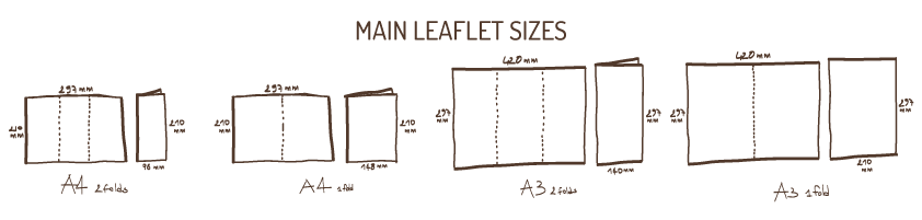
The most common size is an A4 (29.7x21cm) when open, that is 10x21cm when folded.
This size is great because it goes into a standard envelope if you decide to post it.

Then you can have a big A3 (42×29.7cm) that folds into 14×29.7cm.
These are great for menus, or if you need them to be used as a poster on one side for example.

You can also have an A4 that folds into an A5, so open it will still be 29.7x21cm, but it will only have one fold or gate fold, so it will be 14.8 x 21 cm once closed.
Many traders and also takeaways use this format.

You can have the same thing on an A3, so closed with one fold only, or a gate fold it will be an A4 (29.7x21cm).
This is a common size for estate agents and corporate brochures for example.

With every folded size you can then add one or more panels/pages, which will make more space for your content. I won’t get into details here, but ask your printer or designer if you are too tight for the content you have, they’ll be happy to explain what the options are for your chosen size and fold.

Most common leaflet folds

After your leaflet is printed they will be creased (a machine will press them where the fold is meant to go, so that folding is easy) and most times folded for you, unless you want to file them to save some money (don’t underestimate the time it takes!).
Choosing the way your leaflet folds means choosing how to break the content and what to underline, so really stop and give it a thought!

Roll fold
Sketch of roll fold leaflet

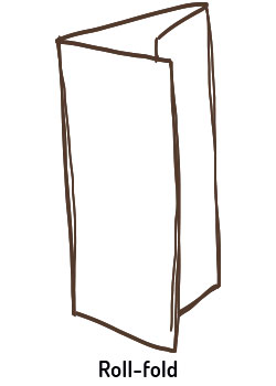
With this fold the different sides roll one inside the other, this allows you to break your content into distinct sections which helps catch your readers eyes and also keeps the attention up.
This is definitely the most common fold, so I’ll stop and help you understand how to tailor your content to make the most of it if you choose it.
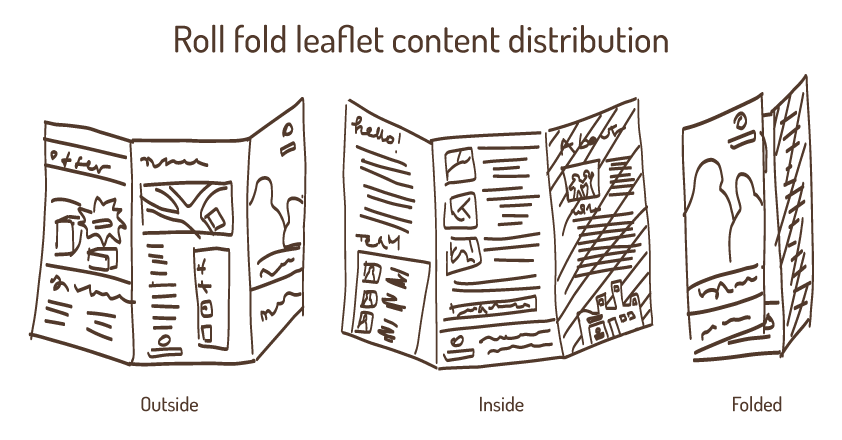

Inside:

You can have your longer, main text that will develop on the three pages. Just make sure you keep the sentences short, break in with bullet points, images or graphs and highlight important points with bolds or boxes.

Leaflet Outside:

Cover:
This is your chance to shine.
Make sure your design is eye catching, choose your photo, illustration or headline carefully and state your main message very clear, whether you are showcasing a new product, an offer or introducing your company for the first time, use just a few works and choose them carefully, don’t try to say it all at once and remember that images and graphics go further and faster ASA first impact!
Don’t forget your logo, and your strap line of you have one.
This page will get your leaflet picked up or not!

Right hand page:
When you look at your open leaflet, you will have one page covering the third one (on the right). That page (which is actually on the outside of the open leaflet) is perfect for an about us, or a list of your products or services with prices, or to highlight a special offer.
This page should have a different background or at least a different graphic layout, this is to help the reader understand that the main text follows below, while this page is to be read separately.

Back:
Don’t be tempted to use this space to just cram in more information.
Being at the back this space is often flat on a surface or simply dismissed, unless it contains info that conclude your subject and your reader will then be looking for, this makes it the perfect space for more technical info such as contact details, an how to find us map, opening times, reviews and social media details.


Sketch of optimal content distribution an a roll fold leaflet.
How to best distribute your content on a roll fold leaflet to increase readability and make the most of the space.
Half fold leaflet
Sketch of half fold leaflet

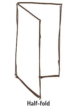
The very basic one, the paper is folded in half on its longer side.
Here you have a cover, a back, and a lot of uninterrupted space for your content. To keep the attention high you should relay on design. Remember, anyone gets really lazy when reading a brochure, make sure you make the important things jump out!

Z fold leaflet
Sketch of Z-fold leaflet

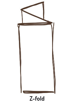
As the word says these leaflets fold into a Z.
This is good for example if you have different categories of products or services because you can break them into different pages, or if you have two main sections of content, for example a corporate area that will go over one side, and a products area that will go on the other. This is because both sides open as a continuous page.
Also you can have the open leaflet designed to look like a little poster.

Gate fold leaflet
Sketch of gate fold leaflet

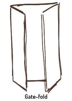
With this fold the closed leaflet is an A5 (15x21cm), but it still has two folds that cover half of the front each.
This fold is used a lot for image based communication as the cover opens like a curtain on the main page.
It’s good for photographers, artists, or to showcase the launch of a new product or service.
In this case the outside will be mainly corporate and light, leaving a more prominent design to the central, main internal page. While the two smaller internal side pages can have description, bullet points and details about the showcased product.

I’ll stop here for now. Hope this helps you decide what is best for your small business.
I’ll leave the what to get ready for your designer and what to expect when commissioning a leaflet for the next time otherwise as google teaches, you’ll get bored and stop reading!
Do get in touch if you need more advice though, I am happy to help!

business cards design blog post illustration

Business cards: Get them right!

Business Cards Illustration

Yes I know, your business cards, like mine, have been sitting in a drawer for the last two years of pandemic. You used to have an office while you now work from home, or you have downsized.
Now that you are starting going to networkings and meeting people in person again, you are wondering if the money you need to spend to update your business cards is worth it in this now highly digital era.

I think business cards are still a very useful tool for any small business, here is why I do, and How to get the best business cards for your small business

Why I still think a small business should have business cards:
  • You can leave them in shops and such.
  • You can give some to your precious referrals and friends.
  • They hold all of your contacts in one single handy place.
  • You can always carry them around with no effort.
  • The large choice of style and paper allows you to show your style and ethos in just a small 5.5×8.5cm piece of paper.
  • They are the most affordable piece of printed communication to replace if your details change.

What size should you go for?

There are many possibilities when it comes to business cards size, and while I went through a passing love for square cards and odd sizes, after 20 years in the field I came to understand that business cards are one of those categories (like websites) in which aligning to the standard brings you more benefits than being too original.

Don’t get me wrong, do unleash the full potential of your brand through the design, paper choice and finish, but I suggest you keep the size standard for one simple reason:

That’s the size wallets and cards holders are made for, and if you are in that size and you ”fit in” your card gains many more chances to be kept for longer and not get ruined or lost by poking out of its pocket.

Front only or front and back?

My humble opinion? Absolutely front and back!
For a small increase in price you get twice the product, and much more use for your cards.

You can:
  • Use the front for corporate contacts and the back for personal details: yours and your employees if you have them, so the front will be the same for everyone, the back will be personal.
  • Use the front for your logo and strap-line only, the back for contacts: this solution is particularly useful if you leave your cards in card displays or around in shops and offices, as it allows you to show your logo nice and big without having to reduce the space for the contact details.
  • Use the back to list your services: Service based business (yes, like me!) often struggle getting people to know all they can offer, with their main services being obvious, while many others are never fully promoted. A business card is the perfect chance to offer “the full menu” right from the greetings!
  • Use the back as a fidelity card: This is good for shops and cafes, and gives your clients one more reason to hold on to your card, you can offer a free goodie when a fully stamped card is returned.
  • Use the back to showcase your products: It’s common for photographers and artists, but could work for many more categories, proving that your products look nice and don’t change too often. In this case you will have to print the back of you card in multiple designs.
  • Use the lightest colours of your branding to design the back, so you have a place with all your contacts to leave someone a handwritten note, this is useful if you meet people at events and need to give an appointment, for example.

As you can see there are many uses for a little square of paper if the other side has all people need to know to recognise your company and get in touch, why waste this chance?

Design guidelines:

I won’t bother you explaining why you shouldn’t use predesigned templates and clip arts, its pretty easy to understand that it’s confusing for someone to receive two business cards that have the very same design but belong to different companies.

If you don’t have the budget to pay for a designer than follow these basic guidelines, if you do work with a designer, than you can be cheeky and check on him/her by these 😉

1 margins:

I’ll never say this enough: 4mm margin all around your card is the minimum you should leave if you want to look professional, getting too close to the edge makes it risky to print, because your design could get cut off when the cards are printed, and give your cards immediately away as not professionally designed.

2 hierarchy:

The most important things, like your name and role and website should be bigger than the rest, social media handles should not rule the place.
Remember that colours contribute to the hierarchy as well, so if all your text is black and your social media icons are the only information in bright colours, those will rap each people before your website, and email, and phone number. If you do it make sure you intend to.

3 Consistency:

Use the same font and size for all text of the same category.
For example the size could decrease gradually from your name, to your role, to all the contact details, and grow bigger again for your website, but you shouldn’t make the email smaller just because the line is too long, if you reduce the email, you reduce all the other contacts accordingly.
Abbreviations and punctuation, these should be coherent as well: if you write tel. then it should also be mob. and Fb. Insta. if one is in full, they all should be.
If one has a colon (:) they should all have a colon.
If one starts with a capital letter, they should al start with a capital and so on.

4 Readability:

Once the design is done print it out in real size, cut and glue back and front together to get a feel for the thicker paper, size, and mainly see the actual fonts size (or ask your designer for a mock-up).
This is very important due to the limited space in business cards that will push you to reduce your images and fonts a lot.
By holding the closest thing to the real one in your hand you’ll be able to make sure everything is readable and if you go for a laser printed proof, you’ll have a decent (if slightly darker) reproduction of your colours as well.

That’s us!
I think this is all you need to know to get good business cards, then you can enjoy the vast offer of printing style and paper available and see what better reflects your business style and values: are you for recycled? Glossy? Craft paper? Every choice you make speaks for your business 😉

Please get in touch for any more information, for a quote of if you think I got something wrong or missed something, I’d love to hear from you!

Corporate advertising space design for Loft Boarding Scotland

How to craft the perfect advertising space

And why paying for the space is definitely not enough

Purchasing an advertising space on a magazine, newspaper, yellow pages, or also on a website or digital magazine can feel like a huge investment for a small business, and once got the space one may think to be done.

The truth is, an advertising space is just that, a little space you pay for because whatever you will place in there will be printed thousands of times and hopefully be seen and kept by many.
What will make that “whatever you place in there” jump off the page, be noticed, deliver your message, though, is design!

If you just leaf through the yellow pages or any local magazine you will notice that there are many recurring errors business owners make when filling in their precious purchased spaces, let’s make sure you score them out before even making that purchase!

1 – Buy what you can afford and accept the size limits.

We all dream of buying the biggest full colour page, maybe the cover’s back, but more realistically we will land on a middle size, few modules space.
Well it’s very important to resize the message you drafted in your mind accordingly:
Don’t try and fit the content of an A4 into a 12×5 cm ad, the result would be a very crammed space and consequentially unclear message.
If you have a small space just make sure your brand colours and logos make obvious to people that it’s you, and then deliver a short clean message, whether it’s a “we exist” shout, a special offer, a change of address or a new service, just clarify (in your mind first of all) what it is that the space is going to say. After that choose carefully the few words that will compose your message and delegate anything else there is to say to a less limited media, by stating a phone number, website or email for example, or letting people request a full leaflet you could post or email.

2 – Quality look

Everyone knows that images become grainy if made too big, not many realise that some image formats can also get blurry if reduced too much in an inappropriate way.
That’s why you can spot many ads with tiny tiny writing shadowed by a blur of the same colour.
When designing your ad choose good quality images and design it (or have it designed) in the correct file size for the space, that way you’ll have the best quality.

3 – Each media is different

Do not print your business card in your advertising space (yes, I have seen it done many times!), business cards are meant to be handed out, with your face and words in toe.
You do not have that with an advertising space, so those words need to be delivered instead by the right copy; your face will instead be delivered by your brand and imagery, or your photo if appropriate.

4 – Nothing wrong with “design included” if you are prepared

Most magazines and newspapers will offer you a design included price or for an extra fee.
That is not necessarily a bad thing, just keep in mind that they won’t be able to devote to your ad the same time a designer you pay on purpose will, so be ready to provide them with the elements they will need, so you put them in condition to do a good job in little time.
Those elements will be: headline – your main message in a handful of words; subtitle – a couple of lines clarifying your message; body text – only if you have the space for it, to explain further; all the contact details you want included; your logo – in good quality jpg, png or best of all a vector file; any additional brand elements such as patterns, separation elements, decorative elements; any photos, illustrations or other imagery; your corporate fonts and colour codes.

5 – How small is small?

I have designed from full page ads on newspapers to manchettes, which are those tiny ads you have on the side of a newspaper flag, on the first page (Tinyyyy!!!), the important thing is to be realistic on what you can have there, and what each kind of ad can give you in return.
In general, people with good eyesight will still read and tolerate a font in size 6, if it’s a simple clear font with good readability, and a logo should still be well recognisable if printed at 2.5cm width.
This should give you an idea of what is definitely too small.

6 – Is black and white just an ad in colours… without the colours?

One more way to save money when purchasing a space is to buy them on black and white pages.
A few things to consider:
When designing for black and white, it’s best to actually design in black and white.
This will help you have a clear vision of what your add will look like since for example a bright red and a bright green will mostly translate to the same tone of grey once converted.
Designing directly in black will make sure you use a deep full black for the main message and create the necessary contrasts by, for example using different sizes of fonts, full bands and boxes where you would have used different colours instead.
One more thing to keep in mind is that photographs often need a touch of contrast when converted in black and white to retain a good level of readability.
Also make sure you use the appropriate version of your logo and consider whether a dark background may in some cases deliver your message better than a white one.

I think this is all, I hope this helps you score off most of the most common mistakes and as always, if you need any more help drop me a line and I’ll be happy to reply.

Guizzo Blog Post: The ABC of Vehicle Graphic

Vehicle Graphics ABC

Why you should brand your company’s vehicle and do it well.

If you have never thought of getting graphics for your company’s vehicle, here is some food for your thoughts. If you had thought of it, but didn’t know where to start I will hopefully answer most of your questions here.

Why should I do it?

Vehicle graphics are an incredible investment for small businesses, of course they do have a cost (basically the more you cover with graphics, the more you pay), but they can last 10 years and over, and they advertise your company every single second of each of those years.
Basically every pair of eyes that settles on your van or car, is one less flyer you need to print and deliver to let potential clients know that your company exists.
How many flyers is that?

What are the options?

Vehicle livery design can range from a magnet you can stick on your door just when you are working: that will cost you about £60 in design + £20 for a small one if you print it cheap; to a full wrapping of your vehicle: that will cost about 400/450 in design (with my rates at least), plus 700/1000 for print and installation (considering a 70/80% wrapping of a small sized car).

Magnets

Plus of magnets:
  • They can come off whenever you want.
  • They aren’t invasive.
  • They are affordable.
Minus of magnets:
  • You need to stick them on flat areas of your vehicle, which often are the bonnet or the doors, which are not always the most readable ones (the bonnet is often seen through a rear mirror, the doors are often too low to be seen from the car queueing on your side).
  • Not being invasive they also attract less attention, and being smaller so are your details.
  • The design does not integrate with your van/car.

Wrapping:

A vehicle wrapping can be as light or as full as you like, and that will reflect on how much you will spend.

Things to keep in mind:

The print price will depend, among other things, also on the quality of the vinyl you print on, if your car in on lease for 5 years, then no point in spending more for better vinyl that will last for 10, if the car is yours then the longer the better!
Good graphics can integrate your car’s colour in the design, so that you don’t need wrapping just to cover the vehicle’s colour.
In general, if you are choosing a car knowing you might want to brand it, I suggest you go for white or a colour that will suit your branding, just like Albany Lettings did with their Fiat 500 (see photo), that will save you a lot of money in wrapping.

If you decide you are ready to invest in vehicle graphic here is my advice:

Make it useful:

Make sure all of your contacts are there and well visible, website, telephone number, email, social media.
Remember it’s a big piece of your branding, and a great form of corporate advertising, so treat it as such.

Make it beautiful:

It will be visible, but if you want it to be memorable, you also have to invest in getting good design.
In most cases the print company will offer you design included in the print price, but will only offer basic options (they can’t afford to spend hours on your design), do consider them, specially if you already have a good range of elements in your branding they can reuse, but for more tailored and detailed designs, then you should contact a designer.

If you don’t have appropriate imagery in your brand assets, this is probably a good chance to get an illustration done, or some photos taken, make sure you then use that same visual on your website and social media as well!

The design should reflect the rest of your branding, have your logo, corporate colour and visual identity, of course, but the best wrappings are usually those who take in consideration the shapes they are on, and either are organically developing around the car/van, or play with it creating optical illusions.
Basically, don’t just stick a photo on the side and contacts at the back!

Make it last:

Choose good quality print and installation, they really makes a difference on the outcome and durability of the wrapping.
Only include long term contact details, for example I would leave out social media if you are not really engaging in them.
This way you will give your wrapping (and your investment) a longer life because it won’t go out-of-date.

Have any more to ask or a comment to make? Just drop me a message here!

Illustration. Here is how “a drawing” can help your small Business.

When is an illustration a good option for your business and why? Let me help you think about it!

When you need an image for your business, you probably think right away about stock images, start browsing your phone’s gallery, or you will think of the good photographers you had the chance to meet at networkings and events.
What you might have never considered is the option of commissioning an illustration.

Central Belt Leaflet Distribution - Central Scotland Map
Central Belt Leaflet Distribution – Central Scotland Map
"How to place an online order" 
Illustration series for Saunderson's butcher in Edinburgh.
“How to place an online order”
Illustration series for Saunderson’s butcher in Edinburgh.

An illustration can be a good idea when:

  • You want to show something that wouldn’t look so good in pictures.
    Let’s say your home office is more a corner in the baby room, but you want to show how you work, an illustration can keep the general look of your desk and things, but cut out the teddy bears and balooned wallpaper.
  • You want to be sure to keep consistency through the years.
    You have changed your salesperson but the photographer that took your team photos five years ago has moved to Puerto Rico.
  • You want to show something that doesn’t exist yet.
    Say you offer a loft enhancement service and want to give an idea of how a loft can look after you are done.
  • You want to avoid stock photography and prefer to have something bespoke and that can also grow and change with you.
    For example you are a leaflet delivery company and want to show what areas you cover with a map, or you are a dog walking company and want to show your services using bespoke icons.
    In both cases a vector illustration allows you to modify the map in the first example, or add/remove/modify the icons in the second.
  • You want to show or hide specific details and do that in a photo would be too complicated or not appropriate.
    For example you want to show your ideal client type without showing the actual shop, or you do massage, waxing or therapies and want to show what the service is like without taking pictures of your actual clients or going for stock images that will not look like your workplace or won’t have the right people or service in them.
  • You want to explain a procedure in a simplified and easy way such as in an “infographic” or “how to series”, because words would be too long and boring.
    For example you want to explain how to order from your shop step by step, or what the steps are to get a boiler installed, or a social media plan or website to be made, or… anything you can think of really!
    Instead of an interminable and not really interesting bullet point list, you can have some images that will explain better and stay with you for use on your social media, website, brochures… anywhere, and they will say so much more about your business!
"How to place an online order" 
Illustration series for Saunderson's butcher in Edinburgh.
“How to place an online order”
Illustration series for Saunderson’s butcher in Edinburgh.

In short, illustration takes all those images that were impossible, because too specific to get into a picture or too hard to find, or just that would be nothing special in a photo, and makes them not only possible, and turns them into an asset for your business: they will be yours forever and will give your branding character and distinction.

If you want to know more, book a free consultation with me,
or to have a look at some more of my past illustration projects click here.

Watch the way you look

Shop front illustration

A few simple questions that will apply to any small business owner with premises:

  • How long since you had a look at your shop or office with the eyes of your new potential customer?
  • How long since you cleaned the sign or checked that the colour of the walls was still the right one?
  • When you last changed your business cards, brochure and website, did you change the shop front accordingly?

Some things may feel very secondary when you are chest deep into running your business but can actually make a big difference to those who don’t know you yet.

Will they see you, find you if…

If you have an orange business card with yellow writing, yellow and orange website, orange and yellow branded car, but your shop is royal blue.
If you use cursive writing for your printed material and website, but your sign’s lettering is as straight as a dye.
These seemingly secondary things could well enough make your potential customer, who is searching you with your corporate image in mind, walk straight past you without finding you.

Your shop sign is definitely the centrepiece of your shopfront so no letters or lightbulbs should be missing, but it is by no means the only important one: wall paint, blinds… everything works together to compose your shop’s image. Also remember, your shop is there even when it’s closed, so make sure your shutters look good too!

Does your shop serve your values?

Let’s say you sell amazing food, you have a very nice brochure and amazing photos on your website, but you couldn’t find the time to redo the shop front which is crackled and took on a brownish dirty tint.
Or maybe your front sign has lost that letter a few years ago and you just couldn’t find the number of that sign company you used, or simply one light is not working anymore.
Stop and think about it, would you eat from a dirty plate?
For passers by your shop equals your product.

The way your shop looks will project on your clients’ expectations of your product or service.
Could they perceive you as dirty, shabby, malfunctioning, just because of the way your shop looks?
Consider, are your on-site sales lower than your delivery sales?

Try to see your company through different media:

What image does your printed material paint of you?
What do you look like through your website and social media?
And what about your premises?

Make sure all of these images of you are:
  • Consistent – send the same image to everyone on any media. Be recognisable.
  • Correct – show your real you, or be a little cheeky and try and look even better.
  • Current – Update your look regularly, your clients change and evolve all the time, so should you.
  • Creative – make sure you make as obvious as possible what makes you different from your competitors.
    You don’t know yet?
    Find out what a Unique Selling Point is on my favourite marketing blog: https://www.sandstonecastles.co.uk/usp-small-business/

Commissioning a website – The cost of a website

Here we are with the fourth and last part of my Commissioning a Website blog series.
You can find out Why your small business needs a website here, How to work with your designer here, and What your designer needs from you to deliver a great website here,
In this post, we will look at the cost that come with a new website and what is and isn’t covered.
Please get in touch if you have any questions and, of course, if you need help with your website!

Every business needs a website these days, but these don’t come free. So, let’s see what costs to expect – some are obvious, others not so much. But at the end of this post, you’ll know them all!

  • Domain name (Ex. www.guizzo.co.uk) – annual cost
    A domain is your chosen address, what people will have to type into their browser to reach your homepage. These are administered by “registrars” and very often “rented” through hosting providers.
    This cost occurs annually and you will have to pay it for as long as your website is online.
  • Hosting space – annual cost
    For your website to be available 24/7, it needs to be on a secure server that is accessible 24/7 and, most importantly, is fast and does not crash.
    These servers are owned by hosting companies. To host your website on their servers, you “rent” a space on one of their hard drives to copy your website on and make it available for anyone to see.
    The best choice for speed, if your clientele is mainly from one country, is for you to choose a host with servers in that same country.
    You will have to pay it for as long as your website is online.
    Consider their customer service as well when choosing: A good one can turn your day around and solve so many little (and big) issues!
  • Theme for your CMS (content management system, such as WordPress, Joomla) – one-off cost
    It’s a starting point for your web designer/developer.
    They will choose the CMS that’s best suited for your needs and then proceed to customise it into your very own website.
    This procedure makes sure your website will comply with the latest standards and be compatible with all the main devices.
    There are many free themes available if you are on a budget, and many different prices. I normally prefer paying rather than going for the free ones, as this normally includes the help of the theme developer for 6 months.
  • Designer/developer – one-off cost
    Some designers/developers charge by project, some by the hour and don’t forget to ask details of what is included in the price you get.
    Make sure to include an introduction into the CMS and theme so you know how to move around your website and make changes on your own.
  • Maintenance contract – monthly/annual cost
    Some developers/designers offer a monthly charge for maintenance and repairs. This may look like a useless extra in your eyes, but it’s definitely not. For one, it will give your website a longer shelf life. Find out why here in Why your small busness needs a website.
  • SEO – one-off cost + eventual updates
    Your website won’t get far if nobody knows it’s there. SEO is the way to let Google, Bing and so on know that you are now out there, get rated and positioned to be found by your potential clients.
    So, remember to add your new web address to all your corporate communication as soon as it’s online and tested!

Here we are, at the end of our journey to a good website for your small business.
Hopefully, you feel more prepared now for this important step in promoting your small business online.
Please get in touch if you would like some more advice or if you have any further questions!

What your web designer/developer needs from you to deliver a great website.

Hello, welcome to post n.3 on all you need to know when commissioning a website (find out Why your small business needs a website and How to work with your web designer/developer), 100% jargon free!
In this post I will help you get ready with all your web designer will expect from you to be able to create a great website.

Creating a website is nothing you can simply outsource and never think about again: It needs your knowledge about your company, product and target market as much as your designer’s creativity, expertise & skills.
For example, for a good quality website content is key and there isn’t much a designer/developer can do about that. While they may be able to help out with visual content (e.g. illustrations, infographics & icons) or suggest a good copywriter, the content needs your input and experience. Additionally, it is down to you to provide your web designer/developer with all the answers they need to deliver a great website on time and on budget.

Here are the main questions you should be able to answer:

1. Do you have a domain and a hosting provider?

Very quickly:

Domain name (e.g. www.guizzo.co.uk) – yearly cost
A domain is your chosen web address (or URL). They are administered by “registrars” and very often “rented” through hosting providers.
You will have to pay it for as long as your website is online.

Hosting space  – yearly cost
For your website to be available 24/7, it needs to be on a hosting server that is reliable and safe, so it does not crash or make you vulnerable to hacking or viruses.
A hosting company usually owns several servers and when you purchase a hosting space, you “rent” a space on one of their hard drives which will store and deliver your website to anyone who types in your domain name.

The best choice for speed (and data security), if your clientele is mainly from one country, is for you to choose a host with servers in that same country. You will have to pay it for as long as your website is online.

2. What is the purpose of your website?

This may sound obvious, but it’s not:

  • Is it a personal blog?
  • Do you just need a presence out there for your local brick-and-mortar shop?
  • Are you looking for more space, to provide info that doesn’t fit on a flyer?
  • Do you need to reach your potential clients on the other side of the globe?
  • Do you want to take bookings, sell tickets or products through the website?

These answers greatly influence the choice of platform, theme and your SEO strategy (what you tell Google about your company) so, think about it, and have the answer ready!

3. Do you want to be able to manage and edit your website yourself?

This will change the kind of contract/service your developer/designer will offer: If you haven’t managed your website before, but you want to, make sure to have some training hours included.
If you don’t want to get involved, then negotiate a monthly/yearly number of hours for updates and troubleshooting. This will make sure your website is in working order, secure and up-to-date at all times.

Having a maintenance contract may look like an indulgent expense, but it’s definitely worth it and will make your life easier as well as your website last longer, find out why here in my post on why you need a website.

What your web designer/developer needs from you:

1. A basic map of your website structure
This can be a simple tree graph in which your homepage is at the top and you detail what pages you wish to be accessible from it and what info will be on each page.

Don’t worry if it doesn’t look good or it’s not very clear, it will only be a starting point for your discussions with the “website builder”. But it will help you think about what you need right from the start.

2. Your company logo
For best results, your web designer or developer will need your logo as vector file (.ai .eps and some versions of .pdf, but not necessarily).
If you don’t have a vector file, look for a logo that still looks sharp when made big on your screen.
If you only have a printed version, say a business card, find a designer who can vectorise it for you.

3. The text for your website pages
While you write, put yourself in your clients’ shoes, see your company and products through their eyes and put yourself in their shoes:
What are they looking for?
What do they want to know?
Is it easy to find?

What do they need to trust your company? Remember that people can get to your website from any page through search engines, social media and other links, so don’t just focus on your homepage.

4. The images you would like on your website
Make sure the images you want to use are yours or free from copyrights.
You can use paid or free stock photography or you can get a photographer to take the photos you want for you. Illustrations, infographics and icon sets can also be great visual content for your website and improve conversions.

With these answers and materials you will be ready to go for your new website. Next (and last) of the series will be about the costs involved in building a website.
See you soon!

See you soon!

Commissioning a website: How to work with your web designer/developer

Laptop, tablet, mobile scketch.

Hello, I was planning a brief blog post to help small business owners who need a company website by explaining who is who, what means what, what the are costs, what to do and expect.
But when I sat down and started collecting the most common questions clients ask before we start working together, the result was about 6,000 words.
So I decided to split it in a series of posts, and here we are, post n.2 on all you need to know when commissioning a website (find n.1 here), 100% jargon free!

First things first:
Web designer, Web developer, Programmer. What is what?

Web designer, web developer, programmer sketch.

Web designer (like me): We have some knowledge of coding (normally mainly css and html) and a lot of knowledge in design and user interface design (how to make your website easy to use so people can find what they are looking for quickly).
A web designer can normally build a simple to medium-sized website based on a content management system such as WordPress, Joomla, Drupal and customise the look and functionalities of it to make it match to your small business’ needs.

Web developer: Often has some knowledge of design, and definitely a whole lot of knowledge in code. A developer can build your whole website for you if you only need basic design, or can work in team with a designer, do the whole setup and even change the way some plugins work or create new plugins for you if required.

Programmer: In most cases you won’t really need a programmer.
There are many different kinds of programmers, but, in general, They all use software to build the core code of a website.
You may need one if you want your theme to be built from scratch or a website that is not based on an existing platform (this is becoming less and less common as standards become more and more important and platforms offer the cheper option with a wide range of customisations).

In my opinion the very best is to have a web designer working in team with a developer.
This can of course be a little more expensive, but you have both the design and the tech sides of your website professionally cared for.
Alternatively, I often offer my clients the choice of starting with me first, having the option to call in a developer only when and if needed.

What you can expect from a web designer/developer:

  • A website matching your brand in tone of voice and design.
    Your logo should be there, and your colours, and the images you use to represent your company in your brochures and advertising spaces.
  • A fully working website, tested on different devices (I.E. laptop, tablet, iPhone, Android) and browsers (I.E. Chrome, Firefox, Edge, Safari).
  • Training on how to edit and mantain your website and/or blog.
  • If required, basic on-page SEO (Search Engine OptimiSation).

Next post in this blog series will be about what your web designer/developer will expect from you, to be able to do an excellent job. Coming soon!!

Website design for Safe and Sound Hound

Why your small business needs a website, and one that keeps up with the times

Guizzo just got its long awaited new website, Just on time to celebrate it’s upcoming birthday. While I was building it, I came up with some tips and ideas that might be usseful for your own website.

So, if you wonder: Why your small business needs a website, and one that keeps up with the times, read on!

Q: Does my business really need a website? And why?

A: In 2019? YES, YOU DO.
While lots of your potential clients still highly value word of mouth, Nowadays most people search for providers online: they want confirmation that your business exist and find out what you can offer even before deciding if they would like to make contact with you. They will also seek past clients’ testimonials and judge your reliability right there, on your website, in search engines and social media.

Q: I already have a website. I’m done now, right?

A: Mmmm… not quite.
Unlike a brochure or a flyer, a website is sort of a living creature.
You do the biggest part of the work when you build it, test it and publish it. But for the search engines to appreciate it, you need to keep it alive.
You do that by updating the content management system (CMS) regularly (WordPress, Joomla and so on), And the same applies to the plugins and, of course, the photos and content.

Q: Why?

A: Because the web, as you will know, hides quite a few threats, and regular updates make sure your website isn’t hacked and you don’t find yourself unknowingly selling drugs, porn or viagra.
Because when a website has been changed, the search engines (like Google) crawl it again, meaning that they go back and check it, and this shows Google and potential clients that you’re still in business.
Because people hardly visit your website more than once. Either because they browse it and decide to become clients (so they don’t need it anymore), or they browse it and decide NOT to become clients, and aren’t bothered any more, unless… you publish material that is appealing to your potential clients, and attracts them back to read/view it and.. would you refuse a second chance?

Q: So what?

A: So I suggest that you decide to call your designer/developer at the very least a couple of times per year, get everything on the “tech side” up to date, and at the same time provide some fresh content as well. If you need some guidance on what this content may be, I suggest you read this: https://www.sandstonecastles.co.uk/content-marketing-ideas-tool/ .
Updating and refreshing regularly also helps you not to lose touch with your developer and consequently with your website.
Many clients I have built a website for had to build a new one either because they had no clue of their developers whereabouts, or because they had neglected the website for so long that no recovery was possible.
Also, I’m not going to lie here, a website, unlike a diamond (to quote one of the best slogans ever conceived), is NOT forever: platforms, code standards and trends evolve continuously, and even though you can update regularly, and grant your website a better, much longer life, you still have to expect to rebuild it every 5-6 years.

Q: Ok, I do need a website. What do I do now?

A: Get started by drafting your sitemap (i.e. which pages you will need and where they should be on the site), get the content drafts ready, get an idea of images you could use, contact a few designers/developers, get quotations and details of how they work. And then pick your favourite out of the bunch!

Make sure to check out my upcoming post about “What to expect from your web designer/developer”.

Flyer for Travelling Teapot

The message: How to craft the content & look of your marketing materials to achieve the best results.

“Communication is about what they hear, not what you say.”

That was my teacher’s favourite motto, saying that no matter how hard you try to say something the only point of view that really counts is the recipient’s.

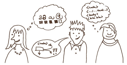
A marketing campaign, a leaflet, a flyer or a banner, whatever media your small business is using, it’s there to deliver a message to your target audience.

Sometimes you want to tell them that you have just opened up or that you have a sales offer on. But most of the time you are simply delivering your company’s message: You are shouting “We are here and we are the best because – INSERT YOUR USP HERE (Find out more about USP – Unique selling point – Here).

At Guizzo, we guide you through a process to collect all the information we need to tailor the perfect message for your marketing communication, not only in terms of design, but also regarding your content and tone of voice.

We never take your content and “just make it pretty”, we make sure it gets your message across as well.
We believe there should be no marketing material without a clear message that is in line with your business and your values.


If you are working with us then you are on the safe side. If not (too bad!) here are a few tips on how to craft your message and brief your designer:

First question to ask yourself is: WHAT DO I WANT TO SAY?

Then: WHO AM I SPEAKING TO? Is the tone I’ve chosen appropriate for them?

Next question to answer is: FURTHER INFORMATION DOES MY TARGET AUDIENCE NEED to follow my call to action?

GUIZZO_HipHopArt+GibsonKerr_FLYERS Once these questions are answered, you are ready to write your text.
Measure and tailor the words so they are appropriate for the medium you are using (don’t stuff thousands of words into a flyer; don’t forget contact details on an advertising space; only put a handful of carefully chosen words in an online banner).

And last but not least think of fonts, colours, images and whatever takes your fancy: Your designer will guide you in choosing the right design elements to strengthen your message and attract the right audience.

Finally, when your layout is ready, don’t forget to step back and… be a stranger for a minute!

Guizzo's tips for local market stalls

Local Markets: How to make your business stand out

At Guizzo  we are passionate about food, craft and makers’ markets, in fact we have been stall holders for quite a good time, although just during the weekends.
We know how at markets you need to face the weather, to withstand the increase/decrease of the amount of business in different months, and to stand out among dozens of fellow traders, often while staying underneath the very same gazebo as anyone else.

Can a designer help with this? We can do much, we believe, but we will start with just a few tips:

Florist stall at the Stockbridge Market.
Make your stall look different from any other :

Do not underestimate the power of a nice drape or tablecloth or bunting in your corporate colour: these will draw people looking for you to the right stall even from far away.

Get your branding and display right

Make sure your banner, business cards, flyers, boards and leaflets look the same and make a coherent image of your company. Make an effort to display your products in a good looking and original way, with packaging display material: you don’t have to buy it all, check on Pinterest for some cheap and new ideas and give craft a go!
All of this contributes to your overall look, and makes people memorise your business.

Fresh produce at St. Mary’s Market
Make sure you are easy to find

Your contacts and social media details should be clearly displayed and memorable, don’t just display social media icons, without a comprehensible link.
Build an internet presence: even the simplest website, with the right branding and contacts can go a long way, increasing the “out of the market business” and letting people know what markets you will attend and when.

Can we help?

If you want to know more about what we can do for you, book a free and relaxed consultation, or be surprised with our friendly design prices, please contact us.

Practical Guide To Design FOR CLIENTS

How to TELL a PROFESSIONAL FROM an AMATEUR DESIGNER by looking at his work

I firmly believe that everyone has the natural ability to recognise a balanced design project that works well (no matter if this is a logo, a leaflet or a website) from an unclear, messy, amateur one.

At home in Edinburgh, flyer for Festival Property Owners.

Just… some people will analyse what they are looking at, and be able to tell what puts them off about it, while others will just have a general negative feeling by mere instinct.

If you are part of this second category of people, especially if you need to hire a designer every now and then, here is a guide for you to get a clearer view of what that negative feeling is generated by, and make you able to recognise a professionally designed product when you are looking for someone to design your new website.


Look for space and margins

A professional designer cannot be scared of empty spaces, they are necessary for readability and style. If the product you are looking at is cluttered with borders, backgrounds and unnecessary images then, it’s a scam!  

Fonts

Sandstonecastles Marketing, corporate flyer.

Beware of designs which use more than three different fonts; fonts are an important choice for a project, if there are too many, that choice has probably not been made at all. Must of all: BEWARE OF COMIC SANS!!

Colours

Colours transmit feelings, so there are appropriate and inappropriate colours for different kinds of products. You wouldn’t make a funeral director sign in pink, or a tanning studio one in freezing cold grey, would you? Also, whatever the project is, colours need to reflect the owner’s company brand. For example if your logo is blue and orange, your leaflet and website should have those as leading colours, in the very same shade, so that your customers will recognise your company and create mental connections.

Images

Beware of text sitting right on pictures, so that the picture is spoiled and in many cases the text cannot be clearly read.
Finally a professional designer will never ever stretch a picture without respecting proportions.
If you see that what you are looking at has squashed all the people so that they look like Snow-White’s dwarves, or that the moon is not round any more, but has turned into an egg, well… Just drop in the bin!