
And why paying for the space is definitely not enough
Purchasing an advertising space on a magazine, newspaper, yellow pages, or also on a website or digital magazine can feel like a huge investment for a small business, and once got the space one may think to be done.
The truth is, an advertising space is just that, a little space you pay for because whatever you will place in there will be printed thousands of times and hopefully be seen and kept by many.
What will make that “whatever you place in there” jump off the page, be noticed, deliver your message, though, is design!

Corporate advertising space design for Loft Boarding Scotland 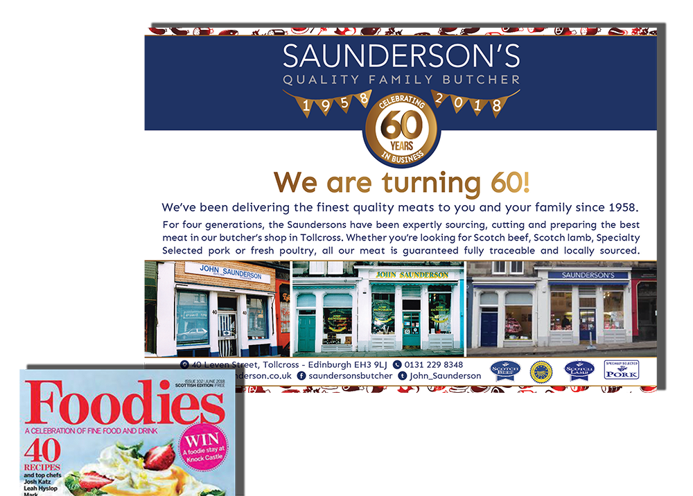
Advertising space design for Saunderson’s Quality Family Butcher 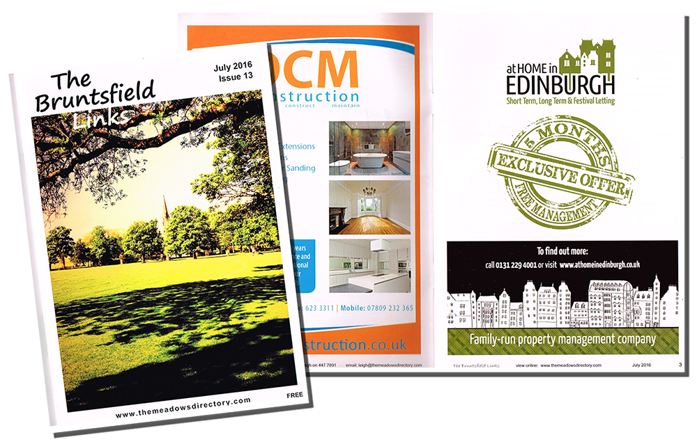
Advertising space design for At Home in Edinburgh 

If you just leaf through the yellow pages or any local magazine you will notice that there are many recurring errors business owners make when filling in their precious purchased spaces, let’s make sure you score them out before even making that purchase!
1 – Buy what you can afford and accept the size limits.
We all dream of buying the biggest full colour page, maybe the cover’s back, but more realistically we will land on a middle size, few modules space.
Well it’s very important to resize the message you drafted in your mind accordingly:
Don’t try and fit the content of an A4 into a 12×5 cm ad, the result would be a very crammed space and consequentially unclear message.
If you have a small space just make sure your brand colours and logos make obvious to people that it’s you, and then deliver a short clean message, whether it’s a “we exist” shout, a special offer, a change of address or a new service, just clarify (in your mind first of all) what it is that the space is going to say. After that choose carefully the few words that will compose your message and delegate anything else there is to say to a less limited media, by stating a phone number, website or email for example, or letting people request a full leaflet you could post or email.
2 – Quality look
Everyone knows that images become grainy if made too big, not many realise that some image formats can also get blurry if reduced too much in an inappropriate way.
That’s why you can spot many ads with tiny tiny writing shadowed by a blur of the same colour.
When designing your ad choose good quality images and design it (or have it designed) in the correct file size for the space, that way you’ll have the best quality.
3 – Each media is different
Do not print your business card in your advertising space (yes, I have seen it done many times!), business cards are meant to be handed out, with your face and words in toe.
You do not have that with an advertising space, so those words need to be delivered instead by the right copy; your face will instead be delivered by your brand and imagery, or your photo if appropriate.
4 – Nothing wrong with “design included” if you are prepared
Most magazines and newspapers will offer you a design included price or for an extra fee.
That is not necessarily a bad thing, just keep in mind that they won’t be able to devote to your ad the same time a designer you pay on purpose will, so be ready to provide them with the elements they will need, so you put them in condition to do a good job in little time.
Those elements will be: headline – your main message in a handful of words; subtitle – a couple of lines clarifying your message; body text – only if you have the space for it, to explain further; all the contact details you want included; your logo – in good quality jpg, png or best of all a vector file; any additional brand elements such as patterns, separation elements, decorative elements; any photos, illustrations or other imagery; your corporate fonts and colour codes.
5 – How small is small?
I have designed from full page ads on newspapers to manchettes, which are those tiny ads you have on the side of a newspaper flag, on the first page (Tinyyyy!!!), the important thing is to be realistic on what you can have there, and what each kind of ad can give you in return.
In general, people with good eyesight will still read and tolerate a font in size 6, if it’s a simple clear font with good readability, and a logo should still be well recognisable if printed at 2.5cm width.
This should give you an idea of what is definitely too small.
6 – Is black and white just an ad in colours… without the colours?
One more way to save money when purchasing a space is to buy them on black and white pages.
A few things to consider:
When designing for black and white, it’s best to actually design in black and white.
This will help you have a clear vision of what your add will look like since for example a bright red and a bright green will mostly translate to the same tone of grey once converted.
Designing directly in black will make sure you use a deep full black for the main message and create the necessary contrasts by, for example using different sizes of fonts, full bands and boxes where you would have used different colours instead.
One more thing to keep in mind is that photographs often need a touch of contrast when converted in black and white to retain a good level of readability.
Also make sure you use the appropriate version of your logo and consider whether a dark background may in some cases deliver your message better than a white one.
I think this is all, I hope this helps you score off most of the most common mistakes and as always, if you need any more help drop me a line and I’ll be happy to reply.