business cards design blog post illustration

Business cards: Get them right!

Business Cards Illustration

Yes I know, your business cards, like mine, have been sitting in a drawer for the last two years of pandemic. You used to have an office while you now work from home, or you have downsized.
Now that you are starting going to networkings and meeting people in person again, you are wondering if the money you need to spend to update your business cards is worth it in this now highly digital era.

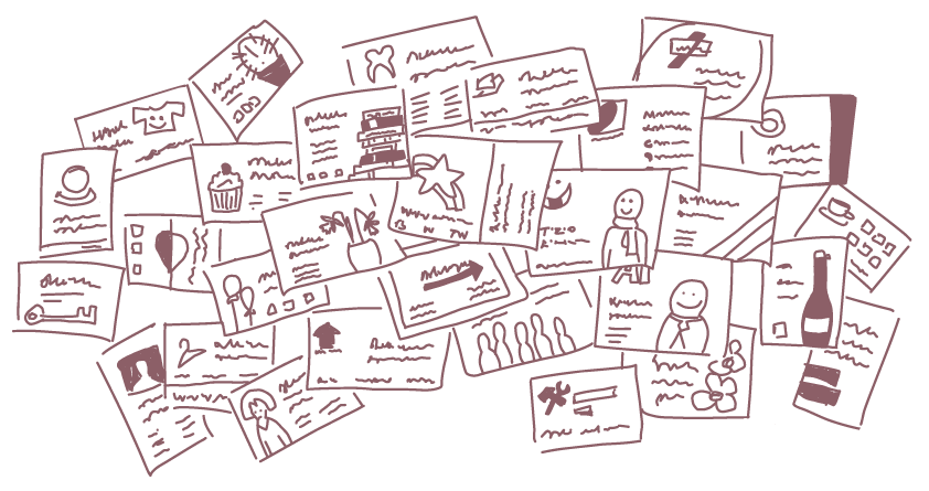
I think business cards are still a very useful tool for any small business, here is why I do, and How to get the best business cards for your small business

Why I still think a small business should have business cards:
  • You can leave them in shops and such.
  • You can give some to your precious referrals and friends.
  • They hold all of your contacts in one single handy place.
  • You can always carry them around with no effort.
  • The large choice of style and paper allows you to show your style and ethos in just a small 5.5×8.5cm piece of paper.
  • They are the most affordable piece of printed communication to replace if your details change.

What size should you go for?

There are many possibilities when it comes to business cards size, and while I went through a passing love for square cards and odd sizes, after 20 years in the field I came to understand that business cards are one of those categories (like websites) in which aligning to the standard brings you more benefits than being too original.

Don’t get me wrong, do unleash the full potential of your brand through the design, paper choice and finish, but I suggest you keep the size standard for one simple reason:

That’s the size wallets and cards holders are made for, and if you are in that size and you ”fit in” your card gains many more chances to be kept for longer and not get ruined or lost by poking out of its pocket.

Front only or front and back?

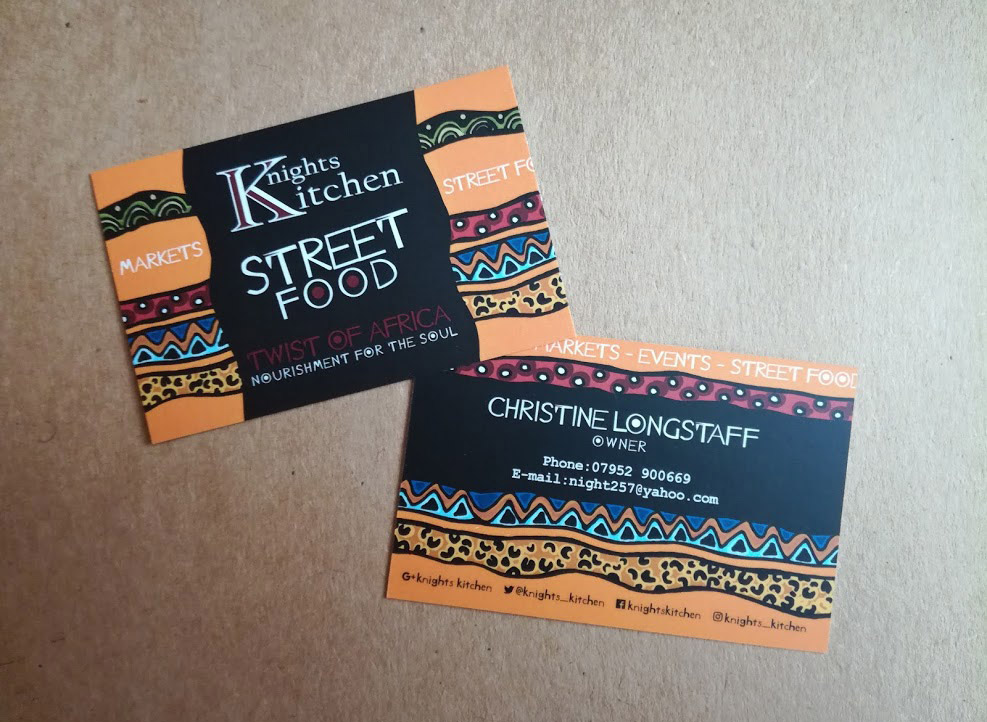
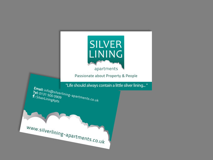
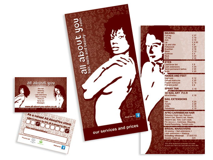
My humble opinion? Absolutely front and back!
For a small increase in price you get twice the product, and much more use for your cards.

You can:
  • Use the front for corporate contacts and the back for personal details: yours and your employees if you have them, so the front will be the same for everyone, the back will be personal.
  • Use the front for your logo and strap-line only, the back for contacts: this solution is particularly useful if you leave your cards in card displays or around in shops and offices, as it allows you to show your logo nice and big without having to reduce the space for the contact details.
  • Use the back to list your services: Service based business (yes, like me!) often struggle getting people to know all they can offer, with their main services being obvious, while many others are never fully promoted. A business card is the perfect chance to offer “the full menu” right from the greetings!
  • Use the back as a fidelity card: This is good for shops and cafes, and gives your clients one more reason to hold on to your card, you can offer a free goodie when a fully stamped card is returned.
  • Use the back to showcase your products: It’s common for photographers and artists, but could work for many more categories, proving that your products look nice and don’t change too often. In this case you will have to print the back of you card in multiple designs.
  • Use the lightest colours of your branding to design the back, so you have a place with all your contacts to leave someone a handwritten note, this is useful if you meet people at events and need to give an appointment, for example.

As you can see there are many uses for a little square of paper if the other side has all people need to know to recognise your company and get in touch, why waste this chance?

Design guidelines:

I won’t bother you explaining why you shouldn’t use predesigned templates and clip arts, its pretty easy to understand that it’s confusing for someone to receive two business cards that have the very same design but belong to different companies.

If you don’t have the budget to pay for a designer than follow these basic guidelines, if you do work with a designer, than you can be cheeky and check on him/her by these 😉

1 margins:

I’ll never say this enough: 4mm margin all around your card is the minimum you should leave if you want to look professional, getting too close to the edge makes it risky to print, because your design could get cut off when the cards are printed, and give your cards immediately away as not professionally designed.

2 hierarchy:

The most important things, like your name and role and website should be bigger than the rest, social media handles should not rule the place.
Remember that colours contribute to the hierarchy as well, so if all your text is black and your social media icons are the only information in bright colours, those will rap each people before your website, and email, and phone number. If you do it make sure you intend to.

3 Consistency:

Use the same font and size for all text of the same category.
For example the size could decrease gradually from your name, to your role, to all the contact details, and grow bigger again for your website, but you shouldn’t make the email smaller just because the line is too long, if you reduce the email, you reduce all the other contacts accordingly.
Abbreviations and punctuation, these should be coherent as well: if you write tel. then it should also be mob. and Fb. Insta. if one is in full, they all should be.
If one has a colon (:) they should all have a colon.
If one starts with a capital letter, they should al start with a capital and so on.

4 Readability:

Once the design is done print it out in real size, cut and glue back and front together to get a feel for the thicker paper, size, and mainly see the actual fonts size (or ask your designer for a mock-up).
This is very important due to the limited space in business cards that will push you to reduce your images and fonts a lot.
By holding the closest thing to the real one in your hand you’ll be able to make sure everything is readable and if you go for a laser printed proof, you’ll have a decent (if slightly darker) reproduction of your colours as well.

That’s us!
I think this is all you need to know to get good business cards, then you can enjoy the vast offer of printing style and paper available and see what better reflects your business style and values: are you for recycled? Glossy? Craft paper? Every choice you make speaks for your business 😉

Please get in touch for any more information, for a quote of if you think I got something wrong or missed something, I’d love to hear from you!

Guizzo Blog Post: The ABC of Vehicle Graphic

Vehicle Graphics ABC

Why you should brand your company’s vehicle and do it well.

If you have never thought of getting graphics for your company’s vehicle, here is some food for your thoughts. If you had thought of it, but didn’t know where to start I will hopefully answer most of your questions here.

Why should I do it?

Vehicle graphics are an incredible investment for small businesses, of course they do have a cost (basically the more you cover with graphics, the more you pay), but they can last 10 years and over, and they advertise your company every single second of each of those years.
Basically every pair of eyes that settles on your van or car, is one less flyer you need to print and deliver to let potential clients know that your company exists.
How many flyers is that?

What are the options?

Vehicle livery design can range from a magnet you can stick on your door just when you are working: that will cost you about £60 in design + £20 for a small one if you print it cheap; to a full wrapping of your vehicle: that will cost about 400/450 in design (with my rates at least), plus 700/1000 for print and installation (considering a 70/80% wrapping of a small sized car).

Magnets

Plus of magnets:
  • They can come off whenever you want.
  • They aren’t invasive.
  • They are affordable.
Minus of magnets:
  • You need to stick them on flat areas of your vehicle, which often are the bonnet or the doors, which are not always the most readable ones (the bonnet is often seen through a rear mirror, the doors are often too low to be seen from the car queueing on your side).
  • Not being invasive they also attract less attention, and being smaller so are your details.
  • The design does not integrate with your van/car.

Wrapping:

A vehicle wrapping can be as light or as full as you like, and that will reflect on how much you will spend.

Things to keep in mind:

The print price will depend, among other things, also on the quality of the vinyl you print on, if your car in on lease for 5 years, then no point in spending more for better vinyl that will last for 10, if the car is yours then the longer the better!
Good graphics can integrate your car’s colour in the design, so that you don’t need wrapping just to cover the vehicle’s colour.
In general, if you are choosing a car knowing you might want to brand it, I suggest you go for white or a colour that will suit your branding, just like Albany Lettings did with their Fiat 500 (see photo), that will save you a lot of money in wrapping.

If you decide you are ready to invest in vehicle graphic here is my advice:

Make it useful:

Make sure all of your contacts are there and well visible, website, telephone number, email, social media.
Remember it’s a big piece of your branding, and a great form of corporate advertising, so treat it as such.

Make it beautiful:

It will be visible, but if you want it to be memorable, you also have to invest in getting good design.
In most cases the print company will offer you design included in the print price, but will only offer basic options (they can’t afford to spend hours on your design), do consider them, specially if you already have a good range of elements in your branding they can reuse, but for more tailored and detailed designs, then you should contact a designer.

If you don’t have appropriate imagery in your brand assets, this is probably a good chance to get an illustration done, or some photos taken, make sure you then use that same visual on your website and social media as well!

The design should reflect the rest of your branding, have your logo, corporate colour and visual identity, of course, but the best wrappings are usually those who take in consideration the shapes they are on, and either are organically developing around the car/van, or play with it creating optical illusions.
Basically, don’t just stick a photo on the side and contacts at the back!

Make it last:

Choose good quality print and installation, they really makes a difference on the outcome and durability of the wrapping.
Only include long term contact details, for example I would leave out social media if you are not really engaging in them.
This way you will give your wrapping (and your investment) a longer life because it won’t go out-of-date.

Have any more to ask or a comment to make? Just drop me a message here!